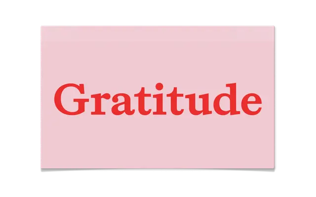
A slab serif that deliberately shifts in personality across its weight range, moving from geometric precision at Light to humanist warmth at Bold.
About
Gratitude is built on a conceptual tension between slab serif geometry and elzevir expressiveness, with lighter weights favouring clean, analytical forms and heavier weights introducing the warmer, more idiosyncratic traits of the elzevir tradition. Eight styles cover four weights from Light to Bold, each with a matching italic, supported by oldstyle figures, tabular figures, fractions, superscripts and a slashed zero. The result is a family that offers a spectrum of typographic temperature within a single, cohesive system.
Classification
Gratitude merges slab serif geometry with elzevir humanist warmth, shifting character across its weight range; lighter cuts lean clinical and geometric, heavier cuts towards expressive humanist slab territory.