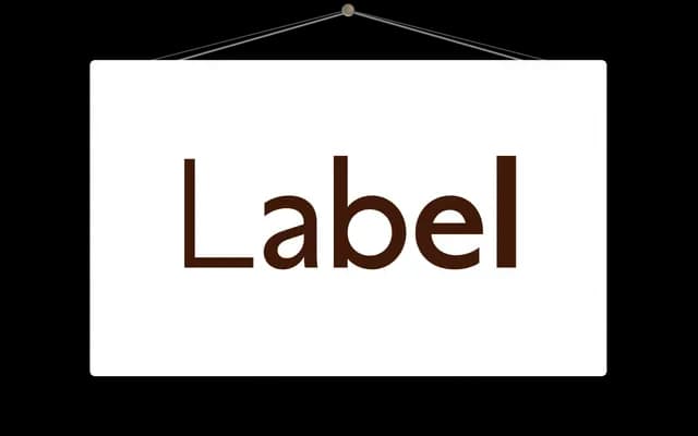
A reductive geometric sans in five weights with matching italics, designed with functional clarity and a restrained expressive character.
About
Built by stripping letterforms back to their most pragmatic shapes, Label sits in productive tension between utility and personality. Alternate forms for 'a', 'u' and '1' give it some flexibility of register, and OpenType features including oldstyle figures, small capitals and tabular figures make it a capable text face. Sample strings drawn from product labelling, recipes and retail copy suggest a natural home in packaging and commercial print.
Classification
Label is built from reductive, pragmatic letterforms with geometric clarity, placing it firmly in the geometric sans tradition. Alternate double-storey 'a' and 'u' forms suggest some humanist inflection, but the default construction is stripped back and utilitarian.