Store Norske Baguette
Store Norske Skriftkompani · Arve Båtevik
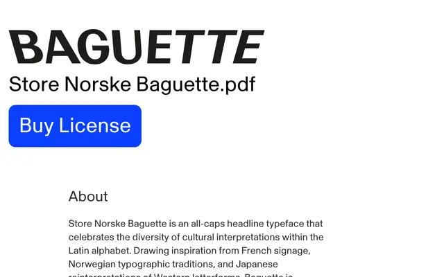
An all-caps variable display typeface by Arve Båtevik, with inclinations of up to 16 degrees in either direction drawn from French, Norwegian and Japanese signage traditions.
About
Designed around the idea that the Latin alphabet is interpreted differently across cultures, Baguette takes cues from French signage, Norwegian typographic conventions and Japanese rereadings of Western letterforms. The family offers one upright style and four inclinations, two leaning left and two right, with the variable font allowing continuous adjustment up to 16 degrees in either direction. Intended for branding and editorial contexts where mixing multiple inclinations in a single layout can produce distinctive, dynamic compositions.
Classification
An all-caps headline typeface with variable inclination, designed explicitly for expressive, experimental typographic arrangements rather than body text; its cultural blending concept and dynamic slant axis place it firmly in the display category.