Store Norske Funksjon
Store Norske Skriftkompani · Arve Båtevik
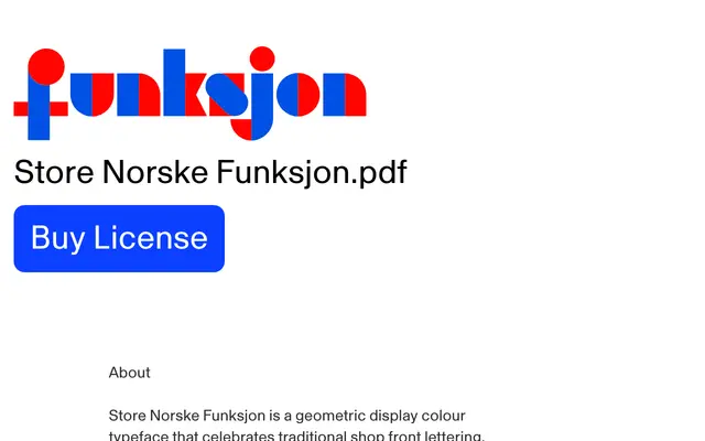
A modular geometric display typeface by Arve Båtevik, reviving a 1933 Oslo shop-front alphabet with a layered two-colour system.
About
Drawn from Knut Schjefstad's 1933 window-decoration guide Moderne Vindusreklame, itself adapted from an earlier Eric Mollowitz design, Funksjon translates that vernacular Oslo lettering tradition into a strict geometry of circles, squares and triangles. Each letter is split into left and right halves available as separate cuts, allowing designers to layer contrasting colours; the Open style offers a single outlined contour, while Natt and Dag each present one open and one closed side per letter. Coverage is compact Western European and Nordic Latin, suited to posters, branding and editorial work that calls for bold, playful geometry.
Classification
Constructed entirely from circles, squares and triangles with a modular colour-layer system, this is a display typeface in the geometric tradition, designed explicitly for poster and editorial use rather than text setting.