Store Norske Geita
Store Norske Skriftkompani · Arve Båtevik
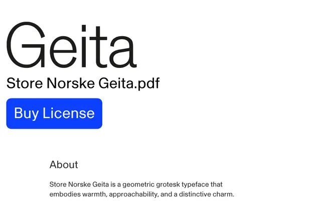
A geometric grotesk drawn from the display cuts of Akzidenz Grotesk, distinguished by trumpet-shaped stroke endings and offered in six weights with matching italics and a monospaced companion.
About
Designed by Arve Båtevik, Geita takes the display cuts of the original Akzidenz Grotesk as its starting point, softening the genre's typical rigidity with expressive trumpet-shaped stroke endings that give the typeface a warmer, more approachable character. Six weights run from Thin to Black, each with a matching italic, covering use cases from impactful headlines down to body text. A monospaced companion, Geita Mono, extends the family into typewriter-inspired territory while retaining the same expressive voice.
Classification
The typeface is explicitly described as a geometric grotesk, rooted in a reinterpretation of the display cuts of Akzidenz Grotesk, combining geometric construction with expressive stroke endings.