Store Norske Graut
Store Norske Skriftkompani · Arve Båtevik
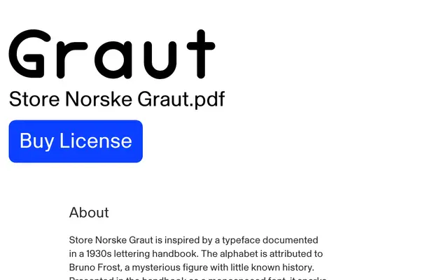
A 1930s lettering alphabet revived by Arve Båtevik, offering variable spacing that shifts smoothly between monospaced and fully proportional letterforms.
About
Rooted in an alphabet attributed to the obscure Bruno Frost and documented in a 1930s Norwegian lettering handbook, Graut is available in three static cuts — Mono, Middle and Normal — and a variable font that spans the full range between them. The letterforms remain consistent across all spacing modes, giving designers unusual flexibility without sacrificing visual coherence. It has found a following in branding and cultural work where its period character and spacing quirk give it a distinct identity.
Classification
Graut originates from a 1930s monospaced lettering alphabet and retains that mono character as its default form, with proportional spacing available as a variant; its geometric, even letterforms place it firmly in the geometric mono tradition.