Store Norske Ja
Store Norske Skriftkompani · Arve Båtevik
sans-serifgeometric sansmono
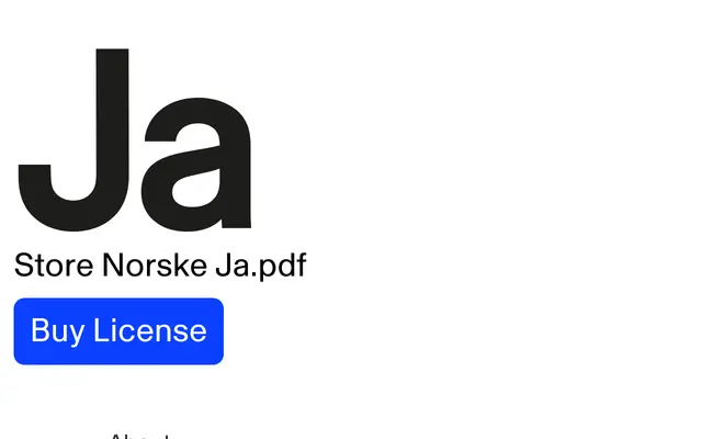
A low-contrast geometric sans by Arve Båtevik, built for digital brand use across dense and minimal layouts.
About
Designed by Arve Båtevik, Ja is a geometric sans-serif that keeps its forms clean and uneccentric, with a generous x-height and balanced proportions suited to screen environments. The name draws on the Norwegian word for 'yes', framing the typeface's adaptability to different tones and contexts. A monospaced companion, Ja Mono, shares the same character, and a custom version was developed for Scribd.
Classification
Low-contrast geometric sans-serif with clean, friendly forms and generous x-height; deliberately avoids eccentric details in favour of broad usability across screen and print contexts.
Family
Ja MonoScribd Ja
Languages
Latin Extended
Tags
geometriclow-contrastdigitalbrandingscreenfriendlyversatile