Store Norske Jazz
Store Norske Skriftkompani · Arve Båtevik
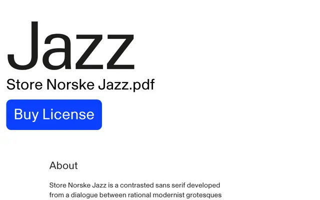
A contrasted sans by Arve Båtevik that holds rational modernist structure in tension with a warmer, more approachable tone suited to identity, editorial and interface work.
About
Drawn from a dialogue between modernist grotesques and warmer lettering traditions, Jazz maintains crisp lines and measured proportions without retreating into anonymity. Its contrast and softer rhythm make it credible across demanding fields such as medicine, finance and technology as well as cultural and editorial contexts where tone matters as much as clarity. A monospaced companion, Jazz Mono, extends the family into typewriter-inspired territory.
Classification
Described explicitly as a contrasted sans serif, blending rational modernist grotesque structure with warmer, more humanist rhythms. The visible stroke contrast sets it apart from neutral grotesques or pure humanist sans families.