Store Norske Leif
Store Norske Skriftkompani · Arve Båtevik
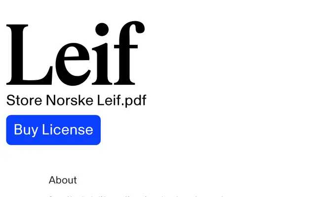
A Times-derived serif by Arve Båtevik that softens the rationalism of its source material with asymmetrical contrast, rounder capitals and a lively italic rhythm.
About
Drawing on three Italian interpretations of Times by Francesco Simoncini, Aldo Novarese and Umberto Fenocchio, Leif preserves the structural versatility of Times while introducing rounder shapes, subtle irregularities and an asymmetrical contrast that gives text a more fluid, approachable cadence. Named after Norwegian comedian Leif Juster, the typeface is aimed at branding, digital projects and body text where a familiar serif structure needs a warmer, more expressive character. A monospaced companion, Leif Mono, extends the family with a typewriter-inspired form carrying the same sensibility.
Classification
Leif draws directly from three Italian interpretations of Times New Roman, retaining the transitional serif structure of its source material while introducing asymmetrical contrast and rounder forms that soften the rational coldness of Times.