Store Norske Litteratur Text
Store Norske Skriftkompani · Arve Båtevik
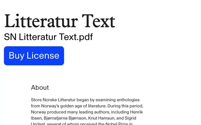
A low-contrast text version of Litteratur, drawn by Arve Båtevik and rooted in Scandinavian anthology typography of the late 19th and early 20th centuries.
About
Where the standard Litteratur carries more optical contrast, this Text variant reduces it to suit dense layouts and extended reading. The large x-height and short ascenders and descenders pack more text into tight measures, while special ligatures support Nordic language rhythm. Language coverage spans Western and Central European, Baltic, Nordic and Sami scripts, with a rich set of OpenType features including small caps, multiple figure styles and localised forms.
Classification
A low-contrast old-style serif drawing on Norwegian and Scandinavian anthology typography from the late 19th and early 20th centuries, with references to typefaces such as Nordisk Antikva and Plantin. The Text variant reduces contrast specifically for dense body text conditions.