Store Norske Minimal
Store Norske Skriftkompani · Arve Båtevik
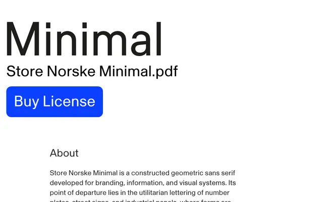
A constructed geometric sans by Arve Båtevik, drawn from the utilitarian logic of number plates and street signs for use in identities, interfaces and signage systems.
About
Taking its formal cues from industrial lettering, Minimal uses near-monolinear strokes and modular construction to produce a typeface that reads as manufactured without feeling mechanical. Optical corrections are deliberately restrained, keeping the underlying geometric logic visible in each form. It is pitched at technology, engineering, science and public information contexts where structure and legibility need to carry across different scales and formats.
Classification
Near-monolinear strokes and strong modular construction place this firmly in the geometric sans-serif tradition, inspired by utilitarian signage and industrial lettering rather than humanist or grotesque forms.