Store Norske Nord
Store Norske Skriftkompani · Arve Båtevik
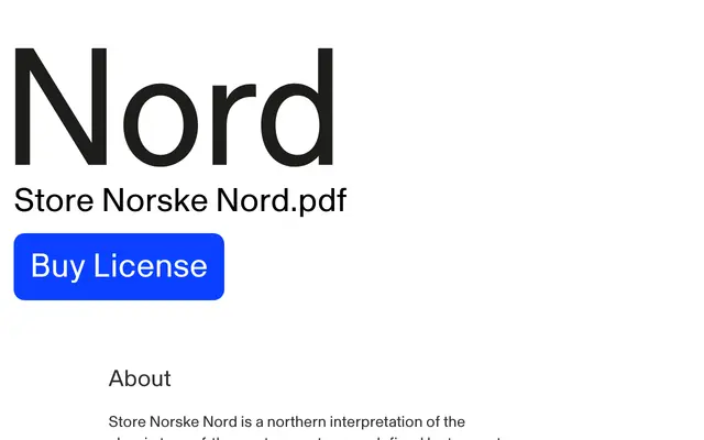
A grotesque with trumpet-shaped stroke endings, designed by Arve Båtevik from Oslo's signage tradition spanning 1864 to 1964.
About
Conceived for the Skrift i Oslo exhibition, Nord draws on a century of Oslo signage lettering to produce a distinctly regional take on the turn-of-the-century grotesque. Eight weights with matching italics cover text and editorial needs, while Nord Plakat extends the family into a display cut informed by 1960s modernist poster lettering, where custom-drawn grotesques compensated for the absence of large-format type. A monospaced companion, Nord Mono, completes the system with the same character in a typewriter-inspired format.
Classification
A turn-of-the-century grotesque with trumpet-shaped stroke endings, rooted in Oslo's signage tradition from 1864 to 1964; sits squarely in the grotesque subgenre with regional Nordic character.