Store Norske Nord Plakat
Store Norske Skriftkompani · Arve Båtevik
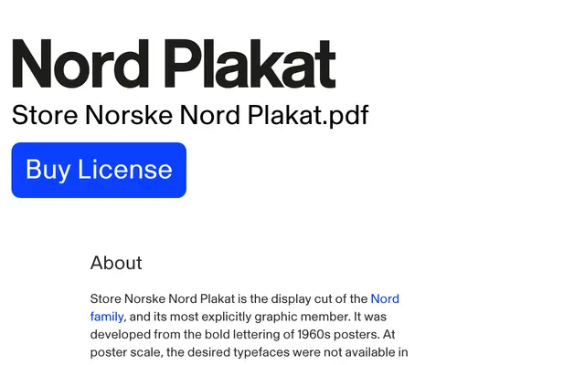
A heavy display cut drawn from 1960s Scandinavian poster lettering, giving any word the presence of custom-drawn type at large scale.
About
Developed from the bold hand-drawn lettering of 1960s posters, where desired typefaces were unavailable in sizes suitable for direct setting and words had to be drawn, enlarged and spaced by eye. Nord Plakat retains the northern grotesque character of the Nord family but pushes the forms toward greater weight, density and graphic force, so that individual letters carry a composition rather than merely occupying it. Suited to posters, exhibition graphics, campaign titles and large-scale identity work where type needs to function as a primary visual element.
Classification
Explicitly positioned as a display cut of a grotesque family, drawn from 1960s poster lettering with heavier weight and greater graphic density than a text grotesque; fits display rather than sans-serif as its primary purpose is large-scale poster and title use.