Store Norske Samvirke
Store Norske Skriftkompani · Arve Båtevik
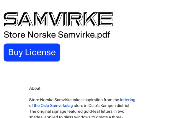
A three-style display typeface reviving the gold-leaf window lettering of a 1916 Oslo cooperative grocery store, designed by Arve Båtevik.
About
Based on the gilt glass signage of the Oslo Samvirkelag store in the Kampen district, the design mimics the layered, stone-carved appearance of the original letters. Three styles offer distinct moods: Karva reproduces the shadowing of the source sign, Solid fills the letterforms for maximum impact, and Open traces only the outer contours for a lighter effect. Coverage is compact, targeting display use in branding, posters and editorial headlines with Western European and Nordic language support.
Classification
Drawn from gold-leaf glass signage with a three-dimensional stone-carving effect, the letterforms are decorative display faces rooted in early twentieth-century Norwegian commercial lettering tradition.