Gradient
Superior Type · Matyáš Machat
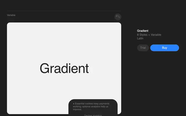
A sans-serif spanning eight weights and a variable axis, built on the tension between geometric construction and handwritten looseness.
About
Designed by Matyáš Machat, Gradient treats individual letterform diversity as a feature rather than an inconsistency, allowing each glyph some expressive latitude. A shared diagonal stroke runs through the family as a unifying thread, referencing multiple 20th-century design languages without committing to any single one. Ten stylistic sets and a broad 308-language Latin coverage give it considerable flexibility for editorial and branding work.
Classification
Described as a transitional typeface bridging constructed sans-serif structures with handwriting-derived freedom; diversity in individual letterforms and a recurring diagonal stroke link it to humanist sans traditions.