Lenora
Superior Type · Vojtěch Říha
serifhigh-contrast serif
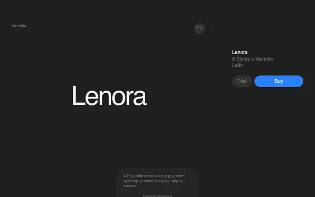
A Didone headline serif by Vojtěch Říha, built around high contrast and expressive curves aimed at fashion and editorial contexts.
About
Drawing from Didot and Bodoni, Lenora is a high-contrast display serif with eight static weights from Thin to ExtraBold, plus a variable font axis. Its proportions and rhythmic contrast are tuned for large-scale headline setting in fashion and editorial work. Twelve stylistic sets and a broad Latin coverage of 308 languages give it practical flexibility beneath its decorative surface.
Classification
Lenora draws explicit inspiration from Didot and Bodoni, placing it firmly in the high-contrast, Didone tradition typical of fashion and editorial headline serifs.
Weights
ThinExtraLightLightRegularMediumSemiBoldBoldExtraBold
Languages
Latin
Tags
didonehigh-contrasteditorialfashionheadlinedisplayelegant