Lenora Grade
Superior Type · Vojtěch Říha
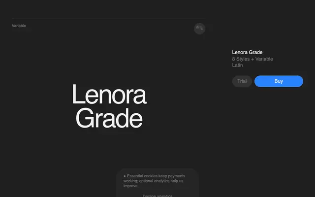
A high-contrast didone serif by Vojtěch Říha, drawing from Didot and Bodoni for headline and fashion editorial work.
About
Designed by Vojtěch Říha, Lenora Grade sits firmly in the didone tradition, borrowing the sharp stroke contrast and refined proportions of Didot and Bodoni. Eight weights run from Thin to ExtraBold, supported by a variable font axis and a broad Latin language coverage spanning 308 languages. The family is pitched squarely at editorial, fashion and luxury branding contexts where expressive contrast and typographic elegance are the primary requirements.
Classification
Lenora Grade draws explicitly from Didot and Bodoni, featuring high stroke contrast and the vertical stress characteristic of the didone tradition, positioned for headline and editorial use.