Micro
Superior Type · Marek Pistora · 2001
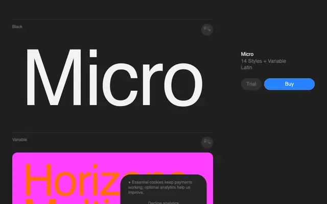
A geometric sans drawn from early-2000s product and digital aesthetics, available in 14 styles and a variable font.
About
Originally conceived in 2001, Micro takes its formal cues from the rounded contours of early portable electronics and the crisper geometry of PlayStation 2-era industrial design. That tension between soft and sharp is built into the letterforms themselves, giving the family a specific period character without tipping into pastiche. Fourteen styles run from Light to Black with matching italics, supplemented by a variable font and a set of OpenType features including oldstyle figures, discretionary ligatures and fractions across 302 languages.
Classification
Micro features rounded forms alongside sharper geometric cuts, characteristic of early 2000s digital product aesthetics; its clean construction and variable axis place it firmly in the geometric sans category.