Nika Condensed
Superior Type · Rostislav Vaněk
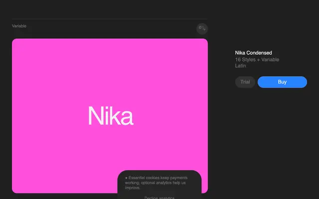
A condensed sans-serif with 16 styles and a variable axis, distinguished by deliberate stroke modulation that adds depth and tension without ornament.
About
Designed by Rostislav Vaněk in collaboration with Matyáš Machat and Petr Kučera, Nika Condensed introduces controlled contrast within strokes to a genre that typically prizes uniformity. Eight weights from ExtraLight to Black each carry italic counterparts, and a variable font file spans the full range. The stroke modulation gives it a sense of movement suited to branding and display work where a plain condensed grotesque would read as inert.
Classification
A condensed sans-serif with deliberate stroke modulation and contrast, departing from the strict uniformity typical of grotesque or geometric sans families.