Adapt
Supertype · Jürgen Huber, Martin Wenzel
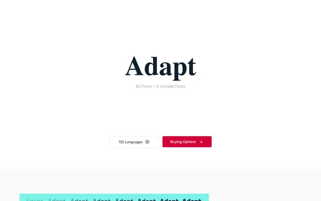
A wide-ranging grotesque family spanning five widths and eight weights, designed to fit text confidently into almost any layout constraint.
About
Designed by Jürgen Huber and Martin Wenzel, Adapt offers 80 static styles across Normal, Narrow, Condensed, Compact and Compressed widths, each available in eight weights from Thin to Black with matching italics. Two variable fonts cover both weight and width axes simultaneously, giving designers continuous control within those parameters. Ink traps, carefully adjusted overshoot and optically corrected x-heights across widths make the family function consistently from body text to tightly set display settings.
Classification
A no-nonsense sans with open terminals, low contrast and a large x-height, consistent with the grotesque tradition. Five width variants from Normal to Compressed confirm it as a utility-driven grotesque rather than a geometric or humanist design.