Clarinetta
Supertype · Jürgen Huber
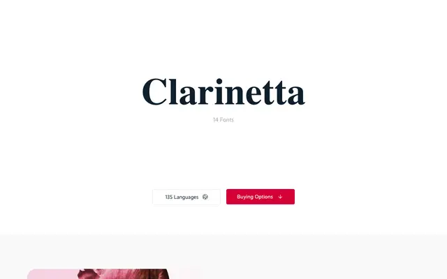
A high-contrast serif by Jürgen Huber spanning seven weights, with an Ultra cut so extreme its serifs touch one another.
About
Built on pronounced serifs and strong stroke contrast, Clarinetta takes classical proportions and pushes them toward contemporary display work. The Ultra weight is the standout: serifs that literally meet at their tips, producing a visually arresting result suited to headlines and poster work. Three numeral sets — tabular, proportional and oldstyle — and coverage for 135 languages via a full Latin Extended character set broaden its usefulness beyond purely expressive settings. A Unicase variant is also available as a separate family.
Classification
A classical serif with deliberately pronounced serifs and strong stroke contrast, placing it firmly in the high-contrast serif tradition, with the extreme Ultra weight pushing it toward display territory.