displayY2K display
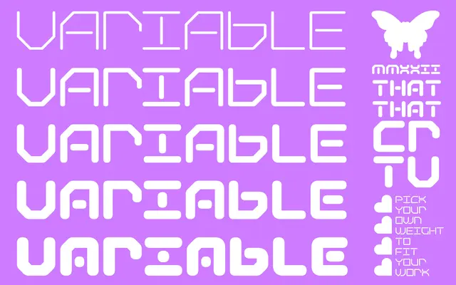
A variable display typeface drawing on Y2K visual culture, available across five weights from Thin to Black.
About
Built as a variable font spanning five weights, Fluta takes its aesthetic cues from the late-1990s and early-2000s digital era. The glyph set covers Basic Latin and Latin-1 Supplement with a selection of extended accented characters, OpenType features including ordinals, superscripts and standard ligatures, and a handful of alternates for A, O and numerals. Positioned squarely at display use, it has no italic or condensed cuts.
Classification
Described explicitly as a Y2K inspired variable display font; the style references late-1990s and early-2000s digital aesthetics rather than any classical typographic tradition.
Weights
ThinLightMediumBoldBlack
Languages
Latin
Tags
displayy2kvariableretrodigitalgeometric