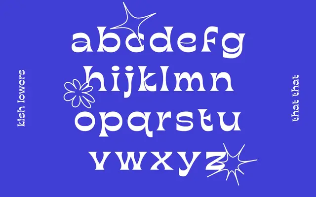
A reverse contrast display face drawing on nineteenth-century Western wood type traditions, released in a single Bold Ultra Wide style.
About
Kish applies the reverse contrast principle characteristic of Victorian-era wood type, where horizontal strokes outweigh vertical ones to create a visually arresting inversion of normal stroke logic. The single Bold Ultra Wide cut suggests use in headline and poster contexts where strong character presence is the primary requirement. Latin Extended character coverage broadens its applicability across Western European languages.
Classification
Kish is explicitly described as a Western reverse contrast font, where horizontal strokes are heavier than verticals, a hallmark of nineteenth-century display wood type traditions. This places it firmly in the display category with a reverse contrast subcategory.