displayreverse contrast sans
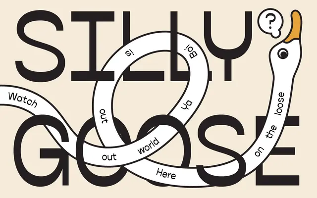
A single-weight reverse contrast sans serif with inverted stroke stress, suited to display and editorial applications.
About
Reverse contrast construction flips conventional stress so horizontal strokes carry more weight than verticals, giving the face an unusual optical tension. The character set covers Latin Extended-A and a range of alternates via stylistic sets, fractions, ordinals and superscripts. At present only one weight is available, limiting its range but keeping the focus on its structural conceit.
Classification
Mackerol is explicitly described as a reverse contrast sans serif, a display-oriented genre where stroke stress is inverted so horizontal strokes are thicker than verticals, placing it firmly in the display category.
Weights
Regular
Languages
Latin
Tags
reverse-contrastdisplaysans-serifexpressivesingle-weighteditorial