OKIE DOKO Variable
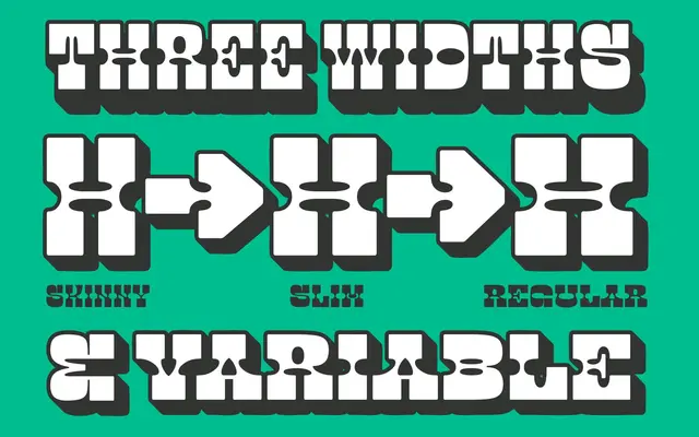
A variable reverse-contrast display face in the Western tradition, offered in three width variants from Regular to Skinny.
About
Built as a variable font with a width axis running from Regular through Slim to Skinny, Okie Doko draws on the reverse-contrast letterforms associated with nineteenth-century Western wood type. The glyph set covers Latin Extended-A with OpenType features including ordinals, superscripts and access to alternate characters for A, O, a, o and numerals. Suited to headlines, poster work and branding where a period-inflected Western character is called for.
Classification
Self-described as a Western Style Reverse Contrast Display Font, with strokes thickened horizontally rather than vertically, a hallmark of Clarendon-influenced Western display types.