Architype Motherwell
The Foundry Types · Wim Crouwel
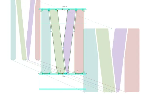
A geometric stencil display family drawn from Wim Crouwel's 1966 exhibition poster lettering for Robert Motherwell at the Stedelijk Museum, Amsterdam.
About
Based on Crouwel's narrow grid system from his Motherwell poster, the family runs across five weights from Light to Heavy, with stencil gaps maintained at a consistent thickness throughout to keep transitions smooth. Alternate lowercase glyphs, extended ligatures, positive and negative circled figures and a Bitcoin symbol extend the character set beyond the original lettering. The gothic-influenced construction and tight geometric discipline make it best suited to editorial display, cultural institutions and poster work.
Classification
A geometric stencil display typeface derived from Wim Crouwel's lettering for a 1966 exhibition poster, characterised by a strict grid system, gothic-influenced construction and stencil gaps throughout all weights.