Architype Renner
The Foundry Types · Paul Renner · 1997
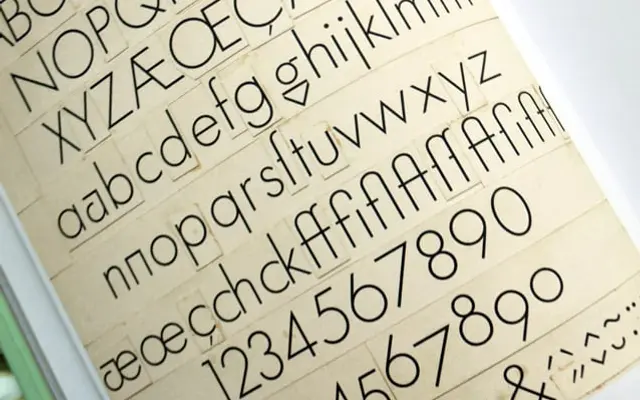
A 1997 revival of Paul Renner's experimental Futura drawings, including letterforms never released by the Bauer Foundry in the late 1920s.
About
Part of The Foundry's Architype One series, this family reconstructs the geometric glyphs Renner drew during Futura's development between 1924 and 1930, alongside alternate letterforms that Bauer suppressed before publication. Four weights from Regular to Bold carry old-style figures and the sharp, pure geometric details of Renner's original vision. It is one of the few typefaces that lets you work directly with the pre-commercial Futura, before optical compromises softened its most radical characters.
Classification
A geometric sans rooted in Paul Renner's experimental drawings for Futura, featuring pure circular forms, minimal stroke contrast and classical Roman proportions, placing it squarely in the geometric sans tradition.