Architype Schwitters
The Foundry Types · Kurt Schwitters
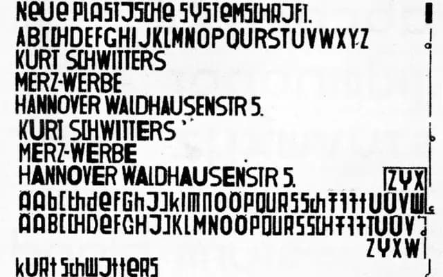
A revival of Kurt Schwitters' 1927 phonetic alphabet, where rounded and weighted letterforms were designed to mirror the sounds of vowels and consonants.
About
Part of The Foundry Types' Architype Konstrukt collection, this face is drawn from Schwitters' Systemschrift of 1927, an experiment in tying visual form to phonetic sound. Heavier, wider, rounded characters represent vowels, giving the alphabet a distinctive rhythmic visual texture. Character sets are intentionally limited owing to the experimental nature of the source material.
Classification
Derived from Kurt Schwitters' 1927 phonetic universal alphabet, this typeface uses heavier, wider, rounded forms to link sound and visual shape, placing it firmly in the experimental avant-garde display category.