Architype Stedelijk
The Foundry Types · Wim Crouwel · 1996
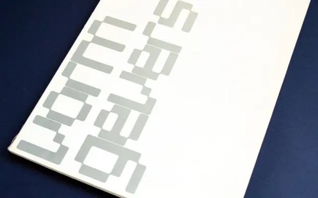
A digital revival of Wim Crouwel's 1968 Vormgevers poster alphabet, built on a rigid 57×41-line grid that gives every letterform a deliberately mechanical appearance.
About
Crouwel originally drew the typeface by hand for the Stedelijk Museum's Vormgevers poster in 1968, using a strict grid of 57 vertical and 41 horizontal lines as the sole constructive logic. The result is a letterform system that looks machine-made despite being entirely hand-rendered, and the iconic black-and-white poster with its visible grid became a landmark of Dutch modernism. The Foundry digitised it in collaboration with Crouwel from 1996 as part of a broader effort to preserve his experimental alphabets.
Classification
Derived from Crouwel's 1968 hand-drawn letterforms built on a strict 57×41 grid, resulting in a machine-like geometric construction with no conventional calligraphic influence; classified as display due to its highly experimental, grid-constrained structure unsuited to continuous text.