Foundry Arkias
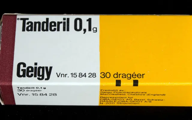
A 39-style geometric sans drawn from mid-century Swiss pharmaceutical packaging, with modular arched forms and pinched connecting strokes across thirteen weights.
About
Taking its visual cues from the simplified letterforms Andreas His designed for J. R. Geigy A.G. packaging in the 1950s, Foundry Arkias is not a revival but a modern interpretation built around a vertical axis, narrow proportions and distinctive dome-like arched terminals. Each of the thirteen weights ships with a standard italic and a Recline variant, and a variable font is included with complete family purchases. Alternative glyphs for key characters, circled numbers and an extended ligature set including a 'www' ligature add flexibility for branding and display work.
Classification
Inspired by the simplified letterforms found in mid-century Swiss pharmaceutical packaging, Foundry Arkias uses a vertical axis, modular dome-like arched forms and narrow proportions characteristic of geometric grotesque typography rooted in the International Typographic Style.