Foundry Form Sans
The Foundry Types · David Quay · 1999
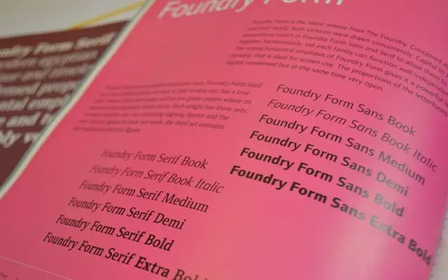
A slightly condensed humanist sans with a pronounced horizontal axis, designed to pair with Foundry Form Serif across shared capital and x-height proportions.
About
Drawn concurrently with Foundry Form Serif, this family shares matching capital and x-height proportions with its serif counterpart so the two can be used together without friction. The defining characteristic is a maximum horizontal axis achieved through shallow connecting junctions and open terminals that finish at near-ninety-degree angles to the vertical, giving the alphabet a low wave-like rhythm. Seven styles run from Book to Extra Bold with matching italics, and the set includes small caps, ligatures, lining and old-style figures in both tabular and proportional spacing.
Classification
Described explicitly as a modern humanistic sans, with open terminals, shallow connecting junctions and a strong horizontal axis that lend it a distinctly humanist character despite its clean angularity.