Foundry Monoline
The Foundry Types · David Quay · 2003
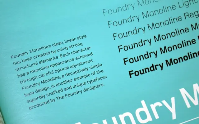
A grid-constructed geometric sans with a consistent single-thickness stroke, designed for branding and editorial use across six weights with matching italics.
About
Conceived in 2000 after the designer observed shop signage in Wiesbaden, Germany, Foundry Monoline uses a structured grid system to produce letterforms that appear to maintain a single uniform stroke weight throughout. The family runs from Ultra Light to Extra Bold with corresponding italics, giving twelve styles in total. The outer weights are particularly effective at large display sizes, where the optical refinements that maintain the illusion of monolinear consistency become most visible.
Classification
A structured, grid-based geometric sans with a single-thickness stroke appearance, placing it firmly in the geometric tradition. Its squarish letterforms and clean linear aesthetic distinguish it from humanist or grotesque approaches.