Foundry Origin
The Foundry Types · Stuart de Rozario · 2008
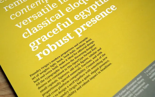
A slab serif by Stuart de Rozario designed from the outset for legibility on screen and in print, with deliberately thickened serifs graded smoothly across seven weights.
About
Designed in 2006-07 when screen rendering of thin serif strokes was still unreliable, Foundry Origin takes an Egyptian approach with serifs substantial enough to hold their shape at small sizes on low-resolution displays. The family runs from Light to Extra Bold with a single italic at Book weight, and the character set includes small capitals, old-style and tabular figures, and ligatures. Its generous x-height and considered proportions make it well suited to editorial, signage and information design.
Classification
Described explicitly as an Egyptian slab serif, with thick, carefully graded serifs across all weights and a strong horizontal dynamic typical of the Egyptian genre, combined with modern proportions and a generous x-height.