Foundry Sans
The Foundry Types · David Quay, Freda Sack · 1990
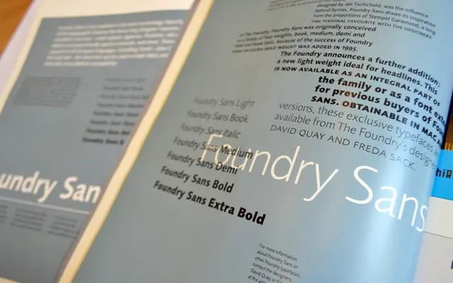
A humanist sans serif by David Quay and Freda Sack, drawn from the proportions of Stempel Garamond and shaped by a conversation with Hans Eduard Meyer at ATypI Paris in 1989.
About
Originally released in 1990 as The Foundry's first sans serif, Foundry Sans takes its proportions from Stempel Garamond in the same way Meyer's Syntax drew on Sabon. The double-storied lowercase 'a' and 'g', low-contrast thick-and-thin strokes, and calligraphic underpinning give it a warmth uncommon in workhorse humanist sans families. Nine styles now span Light through Extra Bold with italic cuts at Normal, Medium and Demi.
Classification
Explicitly described as a humanist sans serif, its proportions drawn from Stempel Garamond and influenced by calligraphic letterforms with double-storied 'a' and 'g', following old-style text typeface principles.