Foundry Unie
The Foundry Types · 2020
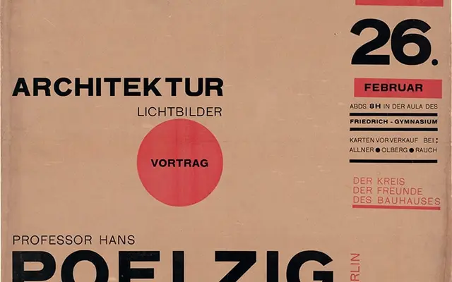
A geometric sans rooted in the Bauhaus and De Stijl tradition, designed primarily for screen use across ten weights with matching italics.
About
Drawn in reference to Futura, Avenir and Tschichold's Universal alphabet, the typeface was created to serve as The Foundry Types' own website font when the studio relaunched in 2020. Its large x-height, low contrast and open terminals give it an even colour across the weight range, from Thin through to Heavy. The result is a clean, unobtrusive typeface suited to branding, screen interfaces and small-size setting.
Classification
Explicitly geometric in construction, drawing from Futura, Avenir and the Bauhaus/De Stijl tradition, with a large x-height and open terminals. The foundry acknowledges humanist underpinnings but the primary classification is geometric sans.