Black
The Letters · Mark Gowing, Alexander Tanazefti · 2018
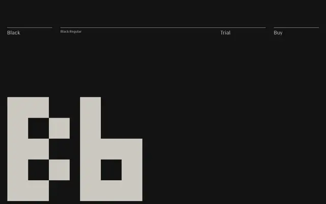
A single-style geometric display typeface built on a strict square grid, originally designed for the Formist identity by Mark Gowing and Alexander Tanazefti.
About
Designed on a minimal square grid, each glyph uses the fewest possible units while preserving a degree of legibility and personality. The design eschews nostalgia for pixel typography entirely, instead embracing its self-imposed constraints to produce idiosyncratic letter forms with no fixed x-height and metrics that allow glyph corners to touch. Small caps, oldstyle figures and an alternate 'o' extend its typographic range despite the single-style limitation.
Classification
Designed on a strict square grid with severely limited proportions and no fixed x-height, Black is a geometric display typeface built from a pure modular proposition rather than any historical serif or sans-serif tradition.