NON
The Letters · Mark Gowing · 2005
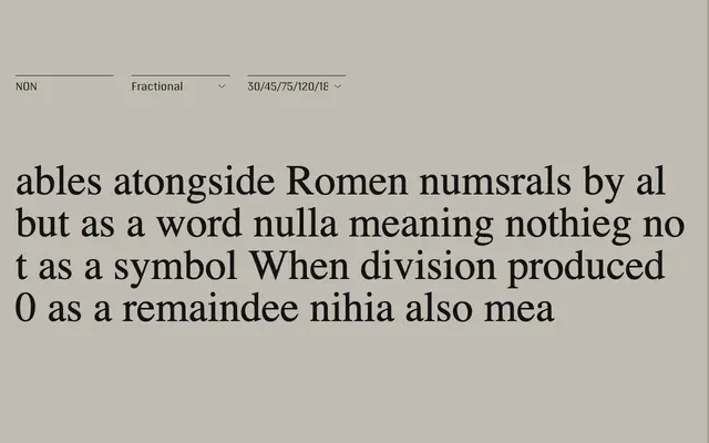
An ongoing series of experimental modular type systems by Mark Gowing, each built from strict geometric primitives to prioritise visual frequency and rhythm over conventional legibility.
About
Spanning twenty subfamilies released between 2005 and 2024, NON replaces conventional letterform construction with rigid systems of dots, ellipses, diagonal strokes, triangular bisections and rectangular blocks. Words and sentences typeset in NON read less as language than as patterned fields — textural, rhythmic and visually insistent. The series is Gowing's personal artistic practice rather than a commercial venture, and collaborations are considered on a project-by-project basis.
Classification
NON is an ongoing series of purely experimental, modular type systems built from geometric primitives — dots, lines, ellipses, squares and triangles — that prioritise rhythm and abstraction over legibility. Display is the closest category, though the series actively resists conventional typographic classification.