Serous
The Letters · Mark Gowing · 2015
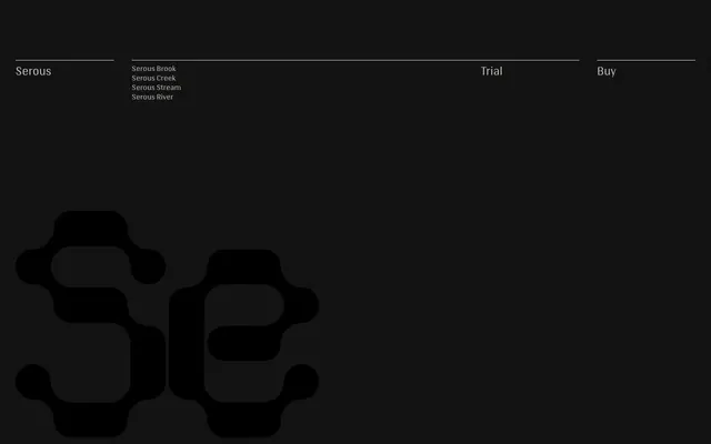
A modular geometric display typeface by Mark Gowing, first conceived in 2008, built on a grid system where characters interlock and layer to create fluid, rhythmic patterns.
About
Drawn on a geometric grid with no right angles and a consistent curve radius throughout, the four styles — Brook, Creek, Stream and River — differ in stroke weight in a way that allows them to be overlaid at the same size to create outline and inline effects. Characters interlock horizontally by default and can be stacked vertically with adjusted leading, making the family as much a graphic tool as a text one. Originally explored for a radio station identity, it found release in 2015 with Ben Kiel handling font mastering.
Classification
A systemised geometric display typeface built on modular grid rules, with no right angles and consistent curve radii. Designed explicitly for display sizes where letters interlock and form graphic patterns.