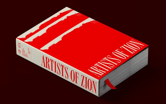
An extra-condensed, high-contrast display serif inspired by 19th-century American wood type, awarded at the Communication Arts Typography Competition in 2023.
About
Six weights with matching obliques and over 400 characters per style, built around tightly spaced letterforms with sharp elongated serifs that add a sense of forward movement. The extreme contrast between thick and thin strokes gives it the visual punch required for headlines and large-scale typography, while the refined serif detail prevents it reading as merely decorative. Variable font support and broad Western, Southern and Central European language coverage make it practical across editorial and branding work.
Classification
High-contrast, extra-condensed letterforms with sharp elongated serifs draw directly from 19th-century American wood type traditions, placing this firmly in the display serif category with a condensed display subcategory.