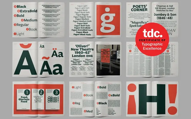
A humanist sans-serif combining broad nib pen strokes with straight-line geometry, awarded a Certificate of Typographic Excellence at TDC69.
About
Fagun blends calligraphic pen-drawing traditions with geometric construction, producing diagonal contrast that sets up a productive tension between internal and external letterform lines. Seven weights run from Thin to Black, each with matching italics, and the family ships with over 700 characters per style covering Western, Southern and Central European Latin. OpenType features include nine number variants, small caps and alternates for a, e, g, l and y, making it well equipped for demanding text-setting work.
Classification
Described explicitly as a humanist sans-serif with calligraphic roots, combining broad nib pen-style strokes with straight-line geometry and diagonal contrast typical of humanist sans classification.