Halcom
The Northern Block · 2015
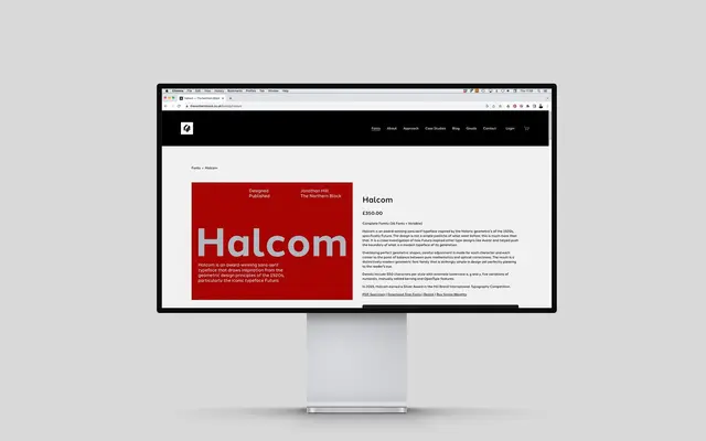
A geometric sans rooted in the Futura tradition, balancing pure mathematical construction with optical correction across 16 styles and a variable font.
About
Drawing from 1920s geometric sans-serifs, Halcom takes Futura and its descendants as a starting point rather than a template, adjusting each character for optical correctness rather than strict geometry. The family ships with 550 characters per style, alternate letterforms for the lowercase a, g and y, five numeral sets and manually edited kerning. It earned a Silver Award at the Hiii Brand International Typography Competition in 2015.
Classification
Explicitly geometric in construction, drawn from the tradition of 1920s geometric sans-serifs with Futura and Avenir as primary references. The design balances pure geometric forms with optical correction.