Hoxton North
sans-serifhumanist sansitalic
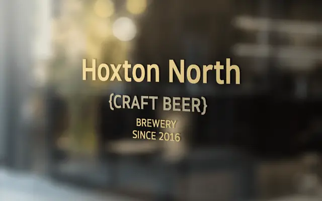
A humanist sans from the north of England drawing on Edward Johnston and Gill Sans, with open forms and seven weights across 14 styles.
About
Built with reference to the London Underground typeface and Gill Sans, Hoxton North offers open letterforms and subtle stroke contrast suited to both print and screen. Seven weights run from Thin to Black, each with a true italic, and the compact proportions make it efficient at text sizes without losing presence at display scale. OpenType features include small caps, five numeral variants and coverage across Western, Southern and Central European Latin.
Classification
Explicitly described as a humanistic sans-serif, citing Edward Johnston and Gill Sans as primary influences, both foundational humanist sans references.
Weights
ThinLightRegularMediumBoldHeavyBlack
Languages
Latin
Tags
humanistsans-serifgill-sans-lineageeditorialcorporateprintdigitalcompact