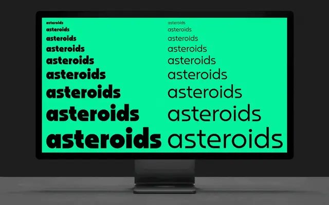
A near-monoline geometric display family drawing on Bauhaus 93 and Atari 2600 cartridge graphics, available in seven weights with matching obliques.
About
The almost-monoline construction references both Bauhaus geometry and the bold, punchy lettering found on Atari 2600 game cartridges, giving it a retro-inflected character that sits between mid-century constructivism and 1980s pop graphics. Seven weights run from Thin to Black, each with an oblique companion, and twenty stylistic alternates introduce a softer, rounded option for added range. Over 500 characters with eight numeral variations and broad European language support make it a practical choice for display-scale branding and editorial work.
Classification
Geometric, near-monoline letterforms with Bauhaus and retro gaming influences place this firmly in the display category; the oblique rather than true italic, bold aesthetic and cartridge-packaging inspiration confirm it as a geometric display rather than a general-purpose sans.