Tor grotesk
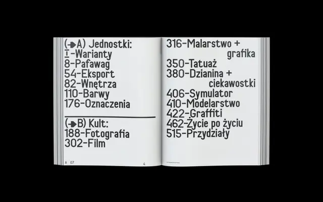
A DIN-influenced geometric sans drawn for a book about radical Polish train enthusiasts, featuring heavily slanted italics and a variable font axis controlling the italic angle.
About
Rooted in the geometric, functional doctrine of DIN typography, Tor grotesk was purpose-built for Kult Jednostki/Radical Passion, a 500-page book documenting Poland's electric train subculture published by Torypress. Its most distinctive feature is a heavily slanted italic, available as a variable font where the angle of inclination can be adjusted across a continuous axis. The design takes visual cues from mid-twentieth century Polish railway standardisation norms and historical train lettering specimens.
Classification
Follows the geometric, industrial doctrine of DIN-style typefaces, developed originally for functional and standardisation purposes, placing it firmly in the geometric sans-serif category with a strong DIN lineage.