Peclet
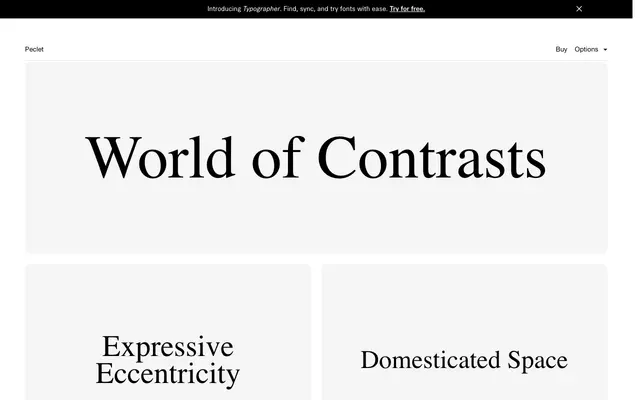
A high-contrast grotesque with nineteenth-century roots, distinguished by unusually low baseline positioning and subtly eccentric terminals across fourteen styles.
About
Short descenders and long ascenders push the baseline uncomfortably low, giving the heavier weights a quality the foundry describes as strong digital gravity. Repetitive minor angles and slightly disproportionate terminals introduce eccentricity without breaking the typeface's underlying rigidity. The family runs from Thin to Black with corresponding italics, covering a broad range of Latin Extended languages including Central and Eastern European scripts.
Classification
Described explicitly as a high-contrast sans serif with roots in nineteenth-century grotesques. The combination of strong stroke contrast with a grotesque structure places it firmly in that subcategory.