Dover Display
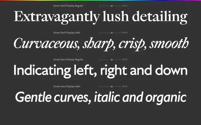
A four-style display family pairing a Caslon-informed baroque serif with a humanist sans drawn from Gill Sans, both reimagined through the lens of a Dutch designer reworking British typographic classics.
About
Dover Display consists of two serif and two sans styles, each designed for large-scale use. The serif cuts lean into Caslon's curly italics, crisp capitals and warm lowercase, aiming to restore the drama that the face's reputation as a default has obscured. The sans counterpart translates that energy through a Gill Sans lens, finding harmonic connections between the two historical sources and producing a family that holds together convincingly across display sizes.
Classification
Dover Display spans two subfamilies: a serif rooted in Caslon's baroque curves and a humanist sans informed by Gill Sans, both positioned as display cuts. The serif leans into historical British models while the sans offers a complementary humanist alternative, both optimised for large sizes.