Dover Text
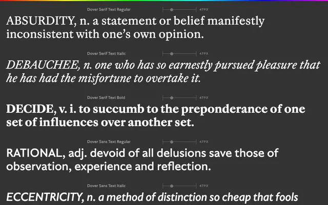
A six-style superfamily pairing a Haas Caslon-derived serif with a geometric sans, designed specifically for text sizes down to eight points.
About
Dover Text is the text companion to Dover Display, built around six styles split between a serif and a sans. The serif draws on Haas Caslon but strips away the stuffiness, retaining historical proportions while modernising the details across over a thousand glyphs per font. The sans counterpart uses matching skeletons and proportions, with nods to Johnston's Underground lettering and Gill's sketches rather than their finished fonts, resulting in a flowing italic and a low-contrast bold that sits consistently across book and screen settings.
Classification
Dover Serif Text is based on Haas Caslon, itself a German interpretation of Caslon's smaller types, placing it firmly in the transitional serif tradition. The paired Dover Sans Text is a geometric sans with humanist influences, but the family is catalogued here under the serif category as the serif is the primary typeface.