Monumental Grotesk
Tiny Type Co. · Piet Zwart (original letters), Tiny Type Co. (revival)
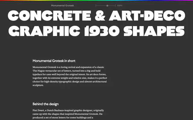
A revival of stone-carved letters designed by Piet Zwart for Berlage buildings in The Hague, recast as a heavy, graphic display typeface with art deco geometry.
About
The letterforms originate from inscriptions Piet Zwart produced for buildings and a monument in The Hague, designed by architect Hendrik Petrus Berlage. Where Zwart's poster work in a similar style feels severe, these Berlage letters have lower contrast and softer corners, lending the design a physical, almost tactile quality. Some glyphs sit deliberately out of proportion with their neighbours, which the foundry frames not as a flaw but as the source of the typeface's expressive energy. An OpenType stylistic set offers inset diacritics as an alternative to the default raised placement.
Classification
Though rooted in grotesque letterform conventions, the typeface's extreme weight, art deco geometry and deliberate graphic imbalance place it firmly in the display category rather than functional grotesque. Its origins in stone-carved architectural lettering reinforce this classification.