Tiny Grotesk
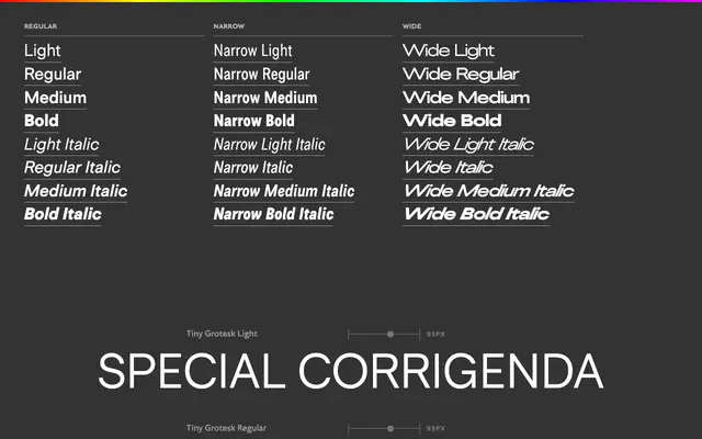
A neogrotesk superfamily whose three widths double as optical sizes, with narrow proportions drawn from 15th-century Italian italic spacing and wide cuts tuned for display.
About
Tiny Grotesk draws on the mid-20th century neogrotesk tradition whilst building in a structural conceit: the Narrow subfamily borrows its lowercase spacing rhythm from Aldus Manutius and Ludovico Arrighi's italics of around 1500, lending it legibility at small sizes, whilst the Wide subfamily uses tight spacing and exaggerated stroke contrast for large-scale use. Italics reinforce the distinction, sloping at a modest 10 degrees in Narrow and a severe 24 degrees in Wide. The result is a compact 27-style family that effectively functions as three optical sizes without requiring separate text and display variants.
Classification
Explicitly described as a modern neogrotesk in the tradition of Helvetica, Univers and Folio, with horizontal and vertical terminals, monolinear strokes and even lowercase proportions typical of mid-20th century neogrotesks.