Portofino
Tipofili · Louise Fili, Matthew Smith · 2022
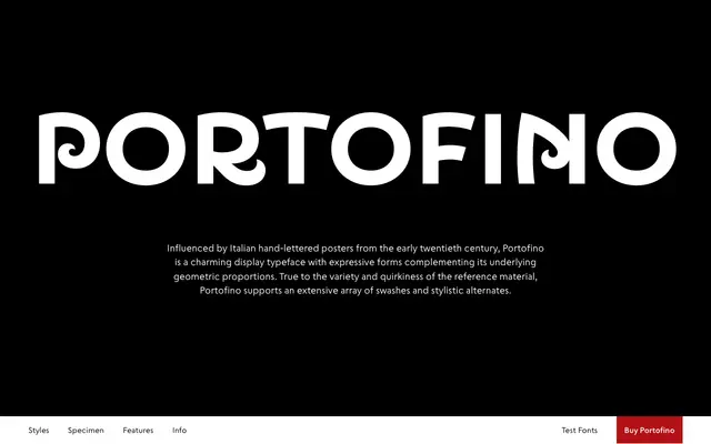
A display typeface by Louise Fili and Matthew Smith drawn from early twentieth-century Italian hand-lettered posters, with geometric proportions and an extensive suite of swashes and stylistic alternates.
About
Designed by Louise Fili and Matthew Smith and released by Tipofili in 2022, Portofino takes its character from the expressive quirkiness of Italian poster lettering of the early 1900s while keeping its underlying structure geometric. Six weights run from Thin to Bold, each accompanied by twelve stylistic sets, swash variants for a broad range of characters, ordinals, fractions and superscripts. The result is a typeface well suited to packaging, editorial headlines and branding where a distinctly Italian warmth is wanted.
Classification
Portofino is a display typeface with geometric underlying proportions and expressive, hand-lettered character, drawing directly from early twentieth-century Italian poster lettering rather than fitting neatly into any text classification.